


Founder and Head Coach Rochelle was frequently fighting with her club’s visual identity. She didn’t feel like the type represented Calypso’s values and it felt unbalanced when centred on a garment or product - much to the frustration of the proud students begging to sport their favourite gymnastic brand’s merchandise! Finding a solution to this issue and speaking to their core brand values of inclusivity, fun and passion with a new identity was going to be a fun challenge, one I was pumped to get my teeth into.


I agreed with a lot of Rochelle’s feelings towards her current logo and lack of an identity system. The design gave me more Caribbean resort vibes than an energetic, welcoming gymnastics club. I noticed both in calls with Rochelle and in the brief that keeping a sense of the Caribbean would be a nice-to-have.
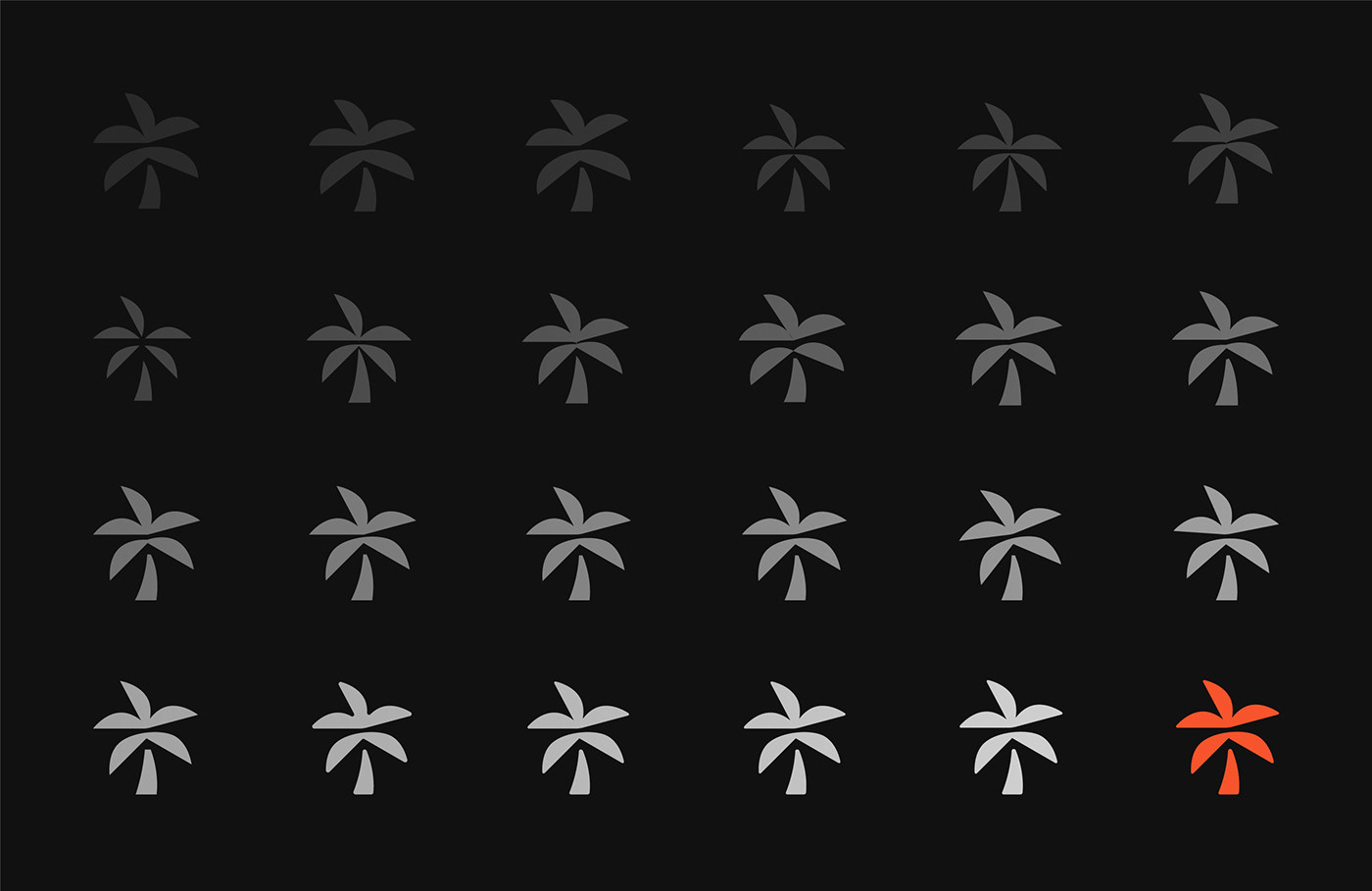
To keep the new direction in line with the brand equity already garnered by the current logo, I was interested to explore other palm tree executions. Initially, I was hyper-fixated on trying to combine caring hands with a palm tree to show Calypso’s care and attention for children from all walks of life. What materialised was some sort of tree doctor logo specialising exclusively in palm trees - big fail. As if by magic (I love when this happens), the idea hit me to combine a palm tree with an abstract person jumping over an object, as shown here in the animation by my good friend Ryan Mitson. It doesn’t scream at you but once you see it, it’s nice little Easter egg that nods to the club’s expertise.
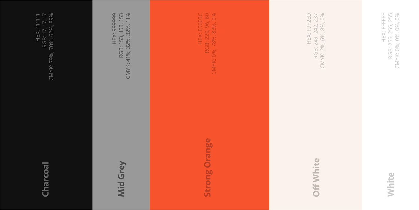

This brief was calling for an energetic palette but I was conscious not to used stereotypically gendered colours such as blue or pink to ensure the club was mutually inviting to all. I lead with a punchy, playful orange supported by some softer calming hues to balance the palette and leave enough room for the orange to sing. I also made some customisations to the logotype - redrawing the S ensuring it felt the same height as the rest of the letters and adding a slight rounded edge to marry up with the logomark. The devil is in the details!


I’m so so proud of this work and even more so having made a little impact on a local business. Rochelle was an absolute delight to work with and I’ll be sure to grab some brand-in-action photos when I go to see a show!
Here’s some awfully lovely words from Rochelle on the work we did together:
“Working with Jack on our club's new branding was an absolute pleasure. His approachability and clear communication made the process seamless. Jack's meticulous attention to detail brought our vision to life in ways we couldn't have imagined. From the initial concept to the final design, he expertly guided us through each stage, ensuring we understood the story behind the brand. The professionalism and creativity he displayed were unparalleled. We are thrilled with the outcome and highly recommend Jack to anyone seeking a remarkable logo or comprehensive rebranding. You won't be disappointed!”


